WCAG for Designers: A Practical Guide to Accessible Design

Design shapes how users experience digital products—but without accessibility, many are excluded. For designers, WCAG offers a clear framework to ensure interfaces are usable by everyone, including people with disabilities. Applying these guidelines early helps create inclusive, legally compliant, and user-friendly designs that work for all.
Run Accessibility Tests Seamlessly
What is WCAG?
WCAG, or Web Content Accessibility Guidelines, is a set of globally recognized recommendations developed by the World Wide Web Consortium (W3C). These guidelines outline how to make web content more accessible to people with a wide range of disabilities—visual, auditory, cognitive, and motor.
WCAG is currently in version 2.2 and is structured under three levels of conformance:
- Level A: Basic requirements for some users to access content.
- Level AA: Deals with the biggest and most common barriers for disabled users.
- Level AAA: The highest and most complex level of accessibility.
While most legal requirements, like ADA and Section 508, align with Level AA, designers are expected to understand how all levels impact visual and interactive design.
Why WCAG Matters for Designers?
Designers are often the first line of defense against accessibility failures. Poor contrast, unreadable fonts, unclear navigation, and non-intuitive interactions often stem from design decisions. When WCAG is ignored:
- Users with visual impairments may not distinguish between UI elements.
- Those relying on keyboards or assistive tech struggle to navigate the interface.
- Dyslexic or neurodiverse users may find content overwhelming or confusing.
Ignoring accessibility not only excludes users—it exposes organizations to legal and reputational risks. Adhering to WCAG empowers designers to create interfaces that work for everyone, regardless of their abilities.
Key WCAG Principles and How They Apply to Design
WCAG is built around four foundational principles, often abbreviated as POUR: Perceivable, Operable, Understandable, and Robust. Each principle has direct implications on design work.
Perceivable
Users must be able to perceive the information being presented. For designers, this means:
- Using sufficient color contrast for text and UI elements.
- Avoiding color as the sole method of conveying information.
- Ensuring images have meaningful alt text or contextually supportive captions.
Operable
Users must be able to interact with the interface. Design considerations include:
- All interactive components should be navigable using a keyboard alone.
- Focus indicators must be visible for buttons, forms, and links.
- Avoid using flashing content that could trigger seizures.
Understandable
The design should help users easily understand content and UI behavior.
- Use consistent navigation patterns and page structures.
- Use clear, concise language in buttons and labels.
- Error messages should be descriptive and suggest corrective actions.
Robust
Content must be compatible with current and future technologies, including assistive tools.
- Avoid using custom components that break native semantics.
- Ensure HTML/CSS is clean and standards-compliant so screen readers can interpret it properly.
WCAG Guidelines Every Designer Should Know
Here’s a breakdown of critical WCAG guidelines that impact design choices.
Text alternatives and images
- Every non-text content must have a text alternative.
- Decorative images should use empty alt attributes (alt="") to be ignored by screen readers.
- Infographics should be accompanied by descriptive text or accessible data tables.
Color contrast and visual clarity
- Maintain a minimum contrast ratio of 4.5:1 for normal text and 3:1 for large text.
- Ensure interactive elements like buttons and links stand out visually.
- Avoid low-opacity overlays that interfere with readability.
Keyboard accessibility considerations
- Interactive elements should follow a logical tab order.
- Ensure focus indicators are clearly visible and do not disappear with custom styling.
- Avoid keyboard traps—once a user navigates to an element, they must be able to exit using the keyboard.
Consistent navigation and layout
- Menus, headers, and footers should appear in a consistent order across pages.
- Elements like search bars or breadcrumbs should retain placement across templates.
- Predictable UI reduces cognitive load and enhances user comfort.
Readable typography and content structure
- Use clear font choices with a minimum size of 16px for body text.
- Maintain consistent spacing and hierarchy using proper headings (H1 to H6).
- Avoid blocks of italicized or uppercase text which are harder to scan.
Error identification and suggestion mechanisms
- Use clear messaging when a user makes an error (e.g., in forms).
- Highlight errors with both color and text to support colorblind users.
- Suggest corrective actions so users can fix the problem efficiently.
Common Accessibility Challenges in Design
Balancing visual appeal with accessibility can be complex, especially when design decisions unintentionally create barriers for users with disabilities. Some of the most persistent challenges include:
- Brand colors that fail contrast requirements: Designers often prioritize brand identity over accessibility, resulting in color combinations that do not meet WCAG contrast ratio guidelines—making text unreadable for users with low vision.
- Hover-dependent interactions: Interfaces that rely solely on hover effects for visibility or functionality exclude users on touch devices and those navigating with keyboards or screen readers.
- Text embedded in images: When critical content is placed within images without alt text or a text-based alternative, screen readers cannot interpret it—rendering the information inaccessible.
- Neglecting mobile responsiveness: Designs that aren’t optimized for responsive behavior disrupt experiences for users using screen magnifiers, zoom features, or small screens, leading to navigation and readability issues.
- Placeholder text used as labels: Using placeholder text inside form fields as the only label causes accessibility issues—placeholders vanish on focus, leaving users confused about what the input requires, especially for users with cognitive impairments or screen readers.
Addressing these challenges early in the design phase ensures a more inclusive and functional user experience for all.
Tools to Check Design Accessibility
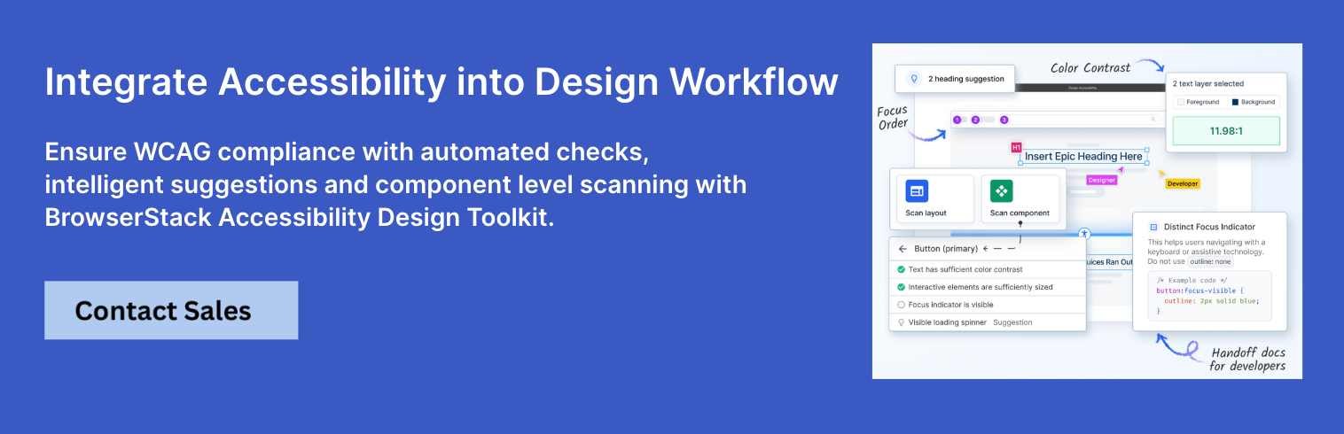
1. BrowserStack Accessibility Design Toolkit
A specialized Figma plugin that enables designers to embed accessibility checks directly into the design process—well before development begins. It helps identify WCAG violations early by validating core design elements against accessibility standards.
Key Features:
- Validate color contrast, typography, and component usage during the design phase
- Instantly check against WCAG 2.1/2.2 standards
- Reduce rework by addressing accessibility issues before handoff
- Integrates seamlessly with existing design workflows
- Part of the BrowserStack platform, enabling end-to-end accessibility testing across real devices and assistive technologies
2. Stark (Figma, Sketch)
A design-focused plugin that brings accessibility insights directly into tools like Figma and Sketch. It helps designers check for compliance without leaving their workspace.
Key Features:
- Checks color contrast ratios in real time
- Simulates various types of color blindness
- Flags non-compliant text styles and color combinations
- Provides visual annotations to guide design corrections
- Works seamlessly inside design environments without needing code
3. Color Contrast Analyzer
A standalone desktop tool that helps designers and developers measure the contrast ratio between text and background elements for WCAG compliance.
Key Features:
- Calculates contrast ratios instantly from any on-screen content
- Eyedropper tool for accurate color sampling
- Supports both normal and large text thresholds
- Identifies whether contrast passes AA and AAA standards
- Available for Windows and macOS
4. Accessibility Insights
A browser extension developed by Microsoft that helps perform automated and manual accessibility assessments of web interfaces.
Key Features:
- Offers fast automated scans for common accessibility issues
- Includes a visual tab focus order inspector
- Step-by-step guided manual test workflow
- Highlights elements that fail WCAG guidelines directly in-browser
- Supports integration into dev and QA workflows
5. Figma Plugins (Able, Contrast)
Lightweight plugins for Figma that allow inline accessibility checks during the design phase. They provide quick validation for visual and structural elements.
Key Features:
- Real-time color contrast evaluation for selected elements
- Flags inaccessible font sizes, weights, or color combinations
- Simple, UI-friendly feedback for non-technical designers
- Integrates smoothly into existing Figma files and teams
- Helps enforce accessibility standards from the wireframe stage
Integrating WCAG into the Design Workflow
Accessibility should not be a separate QA phase—it must be embedded across the workflow.
- Start with WCAG-aligned design systems that enforce consistent patterns.
- Use color palettes that pass contrast tests from the beginning.
- Include accessibility checklists in design review cycles.
- Collaborate with developers and QA to ensure design intent translates to accessible code.
- Annotate Figma or Sketch files with alt text, focus order, and ARIA roles as needed.
Best Practices for WCAG-Compliant Design
To make accessibility second nature, follow these best practices throughout the design process:
- Design with real users in mind: Consider users with low vision, dyslexia, or motor impairments.
- Validate contrast before sign-off: Always test backgrounds, text, and buttons.
- Avoid information-reliant visuals: Never use color alone to convey meaning (e.g., red = error).
- Provide clear visual focus: Ensure users can navigate and see where they are on the page.
- Label everything: Buttons, inputs, icons—every component should have a clear purpose.
- Simplify interactions: Reduce the number of steps in flows to support cognitive accessibility.
How WCAG Compliance Enhances UX
Accessibility and UX are not separate goals—what improves one typically strengthens the other.
- Simplified content improves clarity for all users.
- Consistent navigation benefits users unfamiliar with the site.
- Readable fonts and layouts support users on mobile devices or in bright environments.
- Accessible forms reduce frustration and abandonment.
When accessibility is integrated early, products become not only more inclusive but also more intuitive and user-friendly for everyone.
Choosing the right tool for Accessibility Testing
BrowserStack offers purpose-built solutions tailored to different stages of the accessibility workflow—ensuring designers and developers can address issues early and comprehensively.
For design-specific accessibility testing:
Use the BrowserStack Accessibility Design Toolkit to validate core visual elements like color contrast, typography, and component choices directly within your design workflow. It helps catch WCAG violations early—before handoff—reducing rework and improving design quality from the start.
For full accessibility coverage across real environments:
Use BrowserStack Accessibility Testing to perform end-to-end audits real browsers and devices. It identifies visual, keyboard, and screen reader issues, supports standards like WCAG 2.1/2.2, ADA, and Section 508, and integrates with CI/CD pipelines for continuous compliance.
Here are the key features of BrowserStack Accessibility tool:
- Tests on 3,500+ real browsers and devices—not just Chrome.
- CI/CD-ready for shift-left accessibility testing.
- Visual issue detection with contextual guidance for design remediation.
- Supports WCAG 2.1/2.2, ADA, Section 508, AODA, and more.
- Collaborative dashboards with test logs, reports, and role-based access.
- AI-powered prioritization and Spectra Rule Engine to flag overlooked edge cases.
- Instantly scan any live website for WCAG, ADA, and Section 508 violations using BrowserStack Website Accessibility Scanner—no login or setup required.
BrowserStack supports the entire accessibility lifecycle—from design validation to cross-device audits—helping teams release inclusive experiences with confidence.
Conclusion
Designers play a crucial role in shaping how users experience digital products—and WCAG is their blueprint for inclusion. By understanding the guidelines, embedding them into workflows, and leveraging the right tools, teams can create designs that don’t just look good but work for everyone. Accessibility is not a feature; it’s a foundation. Following WCAG ensures design isn’t just beautiful—but equitable.
For real-world accessibility testing on actual devices and browsers, backed by intelligent automation and industry compliance, BrowserStack Accessibility Testing is a powerful, scalable solution for design and QA teams alike.
Data-rich bug reports loved by everyone
Get visual proof, steps to reproduce and technical logs with one click


Continue reading


Put your knowledge to practice
Try Bird on your next bug - you’ll love it
“Game changer”
Julie, Head of QA


Overall rating: 4.7/5
Try Bird later, from your desktop