The Importance of Color Contrast for Accessibility

Color contrast is a fundamental aspect of accessible digital design, directly impacting the readability and usability of content for users with visual impairments.
Poor contrast can render text unreadable, undermining both user experience and compliance with accessibility standards such as WCAG.
This article explores the significance of color contrast in accessibility, outlines key guidelines, and offers best practices for ensuring content remains clear and inclusive for all users.
Run Accessibility Tests Seamlessly
Understanding Color Contrast in Accessibility
Color contrast in digital design is the perceived difference between one element (such as text or icons) and its surrounding background.
This contrast is usually measured in terms of luminance contrast ratio, which ranges from 1:1 (no contrast) to 21:1 (maximum contrast, like black on white).
Technical Background
Contrast is calculated using the formula defined in the Web Content Accessibility Guidelines (WCAG), which considers the relative luminance of the text and background colors. For instance:
Contrast Ratio = (L1 + 0.05) / (L2 + 0.05
Where L1 is the luminance of the lighter color and L2 is the luminance of the darker color.
Why does Color Contrast Matter for Accessibility and Inclusive Design?
Color contrast directly impacts legibility and comprehension. If users can’t distinguish between text and its background, they can’t read, click, or interact.
Poor color contrast can render essential UI components — like form labels, error messages, and calls to action — completely unusable. This undermines both user experience and accessibility compliance.
Color contrast improves usability for all, but it is especially important for:
- Visually impaired users: Those with cataracts, glaucoma, or diabetic retinopathy may struggle with low-contrast interfaces.
- Color-blind users: Around 300 million people globally have some form of color vision deficiency.
- Neurodiverse users: People with dyslexia or cognitive disabilities benefit from high-contrast, uncluttered visuals.
- Mobile users: Glare and poor screen angles can temporarily mimic visual impairments.
- Elderly users: Age-related vision decline affects contrast sensitivity.
Inclusive design principles emphasize creating experiences that work for everyone, regardless of ability. Ensuring strong color contrast is a key part of that goal. By designing with accessible contrast in mind, teams can deliver interfaces that are more usable, equitable, and effective for a diverse user base.
WCAG Guidelines for Color Contrast
The Web Content Accessibility Guidelines (WCAG) provide specific benchmarks for color contrast. These are widely adopted standards for accessible design:
- Minimum contrast (AA): 4.5:1 for normal text, 3:1 for large text (18pt or 14pt bold)
- Enhanced contrast (AAA): 7:1 for normal text, 4.5:1 for large text
- UI components and graphical elements (like icons) must meet a 3:1 contrast ratio.
Noteworthy Points:
- Text in logos and decorative content is exempt, but best practice encourages compliance anyway.
- Contrast rules apply to placeholder text, error messages, and hover/focus states.
Color Contrast Rules for Accessibility Compliance
Color contrast is not just a design best practice — in many countries, it's a legal requirement. Digital accessibility laws and regulations around the world mandate compliance with standards like the Web Content Accessibility Guidelines (WCAG), which include specific rules for contrast ratios.
Organizations that fail to meet these requirements risk more than just a poor user experience. Non-compliance can lead to legal action, financial penalties, and damage to brand reputation.
Key Accessibility Regulations by Region
United States
- Section 508 of the Rehabilitation Act requires federal agencies and contractors to make electronic content accessible, including meeting minimum color contrast ratios.
- The Americans with Disabilities Act (ADA) has been widely interpreted by courts to apply to websites and mobile apps, especially for businesses serving the public.
European Union
- EN 301 549 mandates public sector websites and mobile apps to comply with WCAG 2.1. Private companies operating across the EU are increasingly expected to meet similar standards.
Canada
- The Accessibility for Ontarians with Disabilities Act (AODA) requires websites and digital services to follow WCAG 2.0 Level AA. Organizations with over 50 employees must file compliance reports.
United Kingdom
- Under the Equality Act 2010, organizations must make "reasonable adjustments" to accommodate people with disabilities. This includes ensuring digital services are accessible, with adequate color contrast being a common failure point.
Risks of Accessibility Non-Compliance for Color Contrast
Failing to meet accessibility standards doesn’t just exclude users—it can also expose organizations to significant legal, financial, and reputational risks. As global regulations tighten and digital inclusivity becomes a baseline expectation, ignoring accessibility is no longer a viable option.
1. Legal Consequences: Many countries enforce digital accessibility through legislation such as the ADA (U.S.), AODA (Canada), and the EAA (EU). Non-compliance can result in lawsuits, government investigations, fines, and mandatory corrective actions.
In recent years, thousands of lawsuits have been filed over inaccessible websites, particularly in sectors like retail, finance, education, and healthcare.
2. Financial Penalties: Legal actions often lead to substantial financial costs, not just in fines, but also in legal fees, retroactive remediation, and the development of accessible alternatives.
Non-compliance can also impact contracts, especially in government or enterprise sectors that require vendors to meet accessibility standards.
3. Reputational Damage: Exclusionary digital experiences can harm brand trust, especially when users publicly share their frustrations on social media or in press coverage.
Being seen as non-inclusive can alienate customers, partners, and investors.
4. Loss of Market Reach: Over 1 billion people worldwide live with a disability. Inaccessible products cut off access to a significant portion of the population, reducing potential user engagement, conversions, and overall growth.
5. Operational Disruption: Addressing accessibility late in the development process or after a legal complaint often requires urgent, resource-intensive changes.
This can disrupt development cycles, delay releases, and increase long-term maintenance costs.
Color Contrast vs. Color Difference
Color contrast and color difference are often confused but serve distinct purposes in design and accessibility. While both relate to how colors interact visually, only color contrast is directly tied to accessibility standards like WCAG.
Common Color Contrast Mistakes
Color contrast problems often originate from aesthetic design choices that unintentionally compromise accessibility. While minimalist and modern designs are visually appealing, they can create readability barriers when contrast is sacrificed for style.
Below are typical contrast issues that negatively affect user experience:
- Light gray text on white backgrounds: Frequently used for placeholder text or secondary content, this combination may look clean, but becomes nearly invisible to users with low vision or glare-affected screens.
- Colored text on similar background tones: Red text on orange, blue on green, or other low-contrast color pairings fail to meet accessibility thresholds and are especially problematic for users with color blindness or low contrast sensitivity.
- Text over images, gradients, or video backgrounds: Busy or dynamically changing backgrounds make text unreadable unless there's a solid background layer or contrast-enhancing overlay. Decorative elements often take priority over functional clarity.
- Buttons and form elements with insufficient contrast: When buttons, particularly disabled or inactive states, lack clear borders or high-contrast text, users may not notice or recognize them as interactive. This can break critical flows such as form submissions or checkout processes.
- Link text that relies solely on color: Using color alone (e.g., blue links in body text without underline) fails accessibility standards and can confuse users who can’t distinguish color differences.
Examples of Poor Contrast
These contrast failures don't just inconvenience users — they carry tangible consequences for accessibility, user experience, and business performance:
- Missed content and CTAs: If they blend into the background, users may overlook essential messages, instructions, or calls to action.

- Lower engagement and higher bounce rates: Users who struggle to read or interact with a page are more likely to abandon it quickly, especially on mobile.

- Increased frustration and task abandonment: Poor contrast can create unnecessary friction, leading users — particularly those with disabilities — to give up before completing actions like sign-ups, purchases, or downloads.

- Negative SEO and compliance risks: Search engines factor usability and accessibility into rankings. Repeated accessibility violations can also expose businesses to legal liability.
Top Color Contrast Checkers and Testing Tools
Color contrast issues can slip into digital products at any stage of development, from design to production. The following tools help identify, test, and resolve contrast violations to meet accessibility standards like WCAG 2.1.
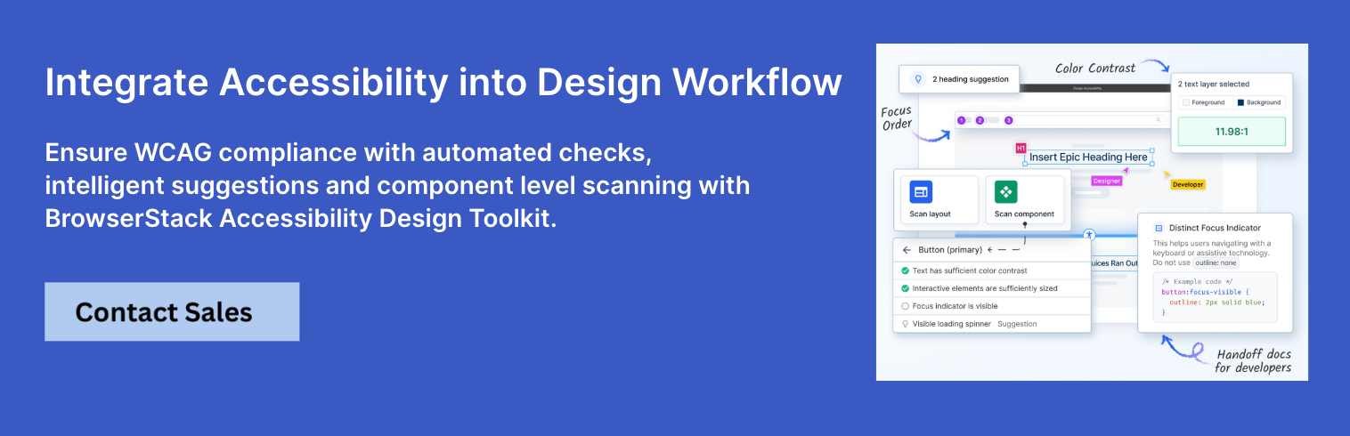
1. BrowserStack Accessibility Design Toolkit
BrowserStack’s Accessibility Design Toolkit is a comprehensive, cloud-based solution for testing color contrast, simulating visual impairments, and running WCAG-compliant audits across real devices and browsers.
Designed for both designers and developers, it enables teams to validate visual accessibility within real-world conditions, making it ideal for integrating contrast checks into agile and CI/CD workflows.
Key Features
- Color contrast analyzer with automated WCAG 2.1 compliance checks
- Cross-browser, cross-device testing on 3500+ real environments
- Simulations for various types of color blindness and low vision
- Support for visual regression and accessibility audits
- Seamless integration with CI/CD pipelines and automation frameworks
Pros
- Real-device testing ensures high accuracy
- Unified platform for both manual and automated accessibility testing
- Scales with teams from design through deployment
2. WebAIM Contrast Checker
WebAIM’s Contrast Checker is a simple, browser-based tool that allows users to quickly evaluate the contrast ratio between foreground and background colors. It's ideal for designers and content creators who want a fast check on whether their color choices meet accessibility standards.
Key Features
- Instant contrast ratio calculation
- Pass/fail indicators for WCAG AA and AAA levels
- Custom input using HEX or RGB values
Pros
- Completely free and easy to use
- No setup or installation needed
Cons
- Doesn’t test hover/focus states or UI interactions
- Limited to static color pairs; no live or coded testing
3. Stark
Stark is an accessibility-focused plugin for popular design tools like Figma, Sketch, and Adobe XD. It empowers design teams to check contrast and simulate color vision impairments within their design environments, making accessibility part of the creative workflow.
Key Features
- Real-time contrast validation inside design files
- Simulations for multiple color vision deficiencies
- Accessibility-focused design linting and suggestions
Pros
- Integrated directly into design tools
- Helps designers bake accessibility into the early stages
Cons
- Free tier is limited; advanced features require a subscription
- Doesn't support live code or production environments
4. Color Oracle
Color Oracle is a desktop application that simulates various types of color blindness by applying a full-screen filter to your monitor. It helps designers and developers understand how users with vision deficiencies perceive their interfaces.
Key Features
- Full-screen simulations for protanopia, deuteranopia, and tritanopia
- Platform support for macOS, Windows, and Linux
- Works on any design or browser view
Pros
- Very accurate simulations
- Useful during both design and development phases
Cons
- No contrast ratio calculations or WCAG validation
- Not integrated with design tools or code environments
How to implement Color Contrast?
To ensure accessible color contrast from the start, follow these best practices:
1. Use sufficient contrast ratios for all text: All text elements, including body content, headings, labels, and instructions, should meet WCAG 2.1 guidelines. Normal-sized text must have a minimum contrast ratio of 4.5:1, while large text (18pt or 14pt bold and above) requires at least 3:1.
For enhanced readability, especially for users with low vision, aim for a contrast ratio of 7:1 or higher.
2. Design for multiple states: Buttons, links, and form elements often change appearance based on user interaction. Each state—default, hover, focus, and disabled—must retain sufficient contrast against its background. Ensure that disabled elements are still distinguishable and legible, not overly faded or washed out.
3. Don’t rely on color alone to convey meaning: Avoid using color as the only visual cue for critical information. For example, instead of showing an error using red alone, include an icon or text label. This is essential for users with color blindness who may not distinguish certain hues.

4. Test contrast across various environments: Users interact with content under different conditions—sunlight, low brightness, and various screen types. Ensure that contrast remains effective in both light and dark modes and under real-world lighting. Avoid translucent overlays or gradient backgrounds that reduce readability.
5. Optimize contrast for non-text elements: WCAG requires at least a 3:1 contrast ratio for user interface components and graphical elements. Icons, borders, input outlines, and focus indicators should all meet this requirement, especially when they are thin or low-weight.
6. Avoid low-contrast placeholders and secondary text: Placeholder text in forms is often styled in light gray, making it difficult to read. Ensure that it meets the same contrast standards as body text. Secondary or de-emphasized text should still be legible and not visually “disappear.”

7. Use accessible color palettes from the start: Incorporate WCAG-compliant color combinations into your design system. Pre-validated accessible palettes reduce guesswork and promote consistency across teams. Many online tools can help generate or verify contrast-compliant color sets.
8. Test with real users and vision simulators: Automated tools catch technical violations, but real users provide feedback on usability. Use simulators to test how your designs appear to users with color blindness, low vision, or other visual impairments.
9. Account for brand colors without sacrificing accessibility: Brand guidelines often prioritize aesthetics, but not all brand colors are accessible. Create alternate shades that maintain the essence of your brand while ensuring contrast compliance, especially for text and interactive elements.
10. Integrate contrast checks into the design and development process: Make color contrast checks a part of every design review and development sprint.
Tools like BrowserStack’s Accessibility Design Toolkit allow you to run automated WCAG audits, simulate vision impairments, and validate contrast on real browsers and devices. This integration ensures accessibility is maintained across environments and throughout the development lifecycle.
Conclusion
Color contrast is more than a design detail — it's a critical accessibility requirement. Ensuring readable, navigable, and inclusive interfaces means prioritizing contrast from the beginning of the design process. It helps users of all abilities, reduces legal risk, and enhances overall user experience.
Designing for accessibility is designing for everyone. And that begins with something as fundamental as color contrast.
Frequently Asked Questions (FAQs)
- Are logos and decorative text subject to contrast requirements?
No, logos and purely decorative text are exempt from WCAG contrast rules. However, if the text conveys important information, it must meet contrast guidelines. - What contrast ratio is required for large text?
Large text (at least 18pt regular or 14pt bold) requires a minimum contrast ratio of 3:1 under WCAG 2.1 AA. - How do I test contrast effectively?
Use automated tools like BrowserStack Accessibility Scanner, WCAG Contrast Checker, or Lighthouse, and verify with manual checks in both light and dark modes across real devices. - Do gradients affect color contrast?
Yes, gradients can complicate contrast evaluation. You must ensure that all parts of the gradient background maintain the required contrast with the text overlay. - Is contrast testing required for disabled or inactive elements?
Not always. Inactive or disabled elements (like grayed-out buttons) are often exempt, but they should still be distinguishable for usability and clarity.
Data-rich bug reports loved by everyone
Get visual proof, steps to reproduce and technical logs with one click


Continue reading


Put your knowledge to practice
Try Bird on your next bug - you’ll love it
“Game changer”
Julie, Head of QA


Overall rating: 4.7/5
Try Bird later, from your desktop